Granny Slice
Brief
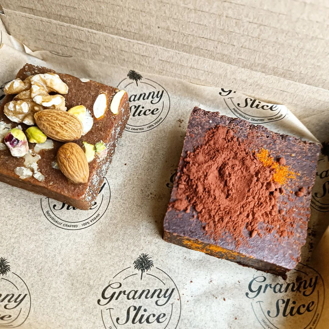
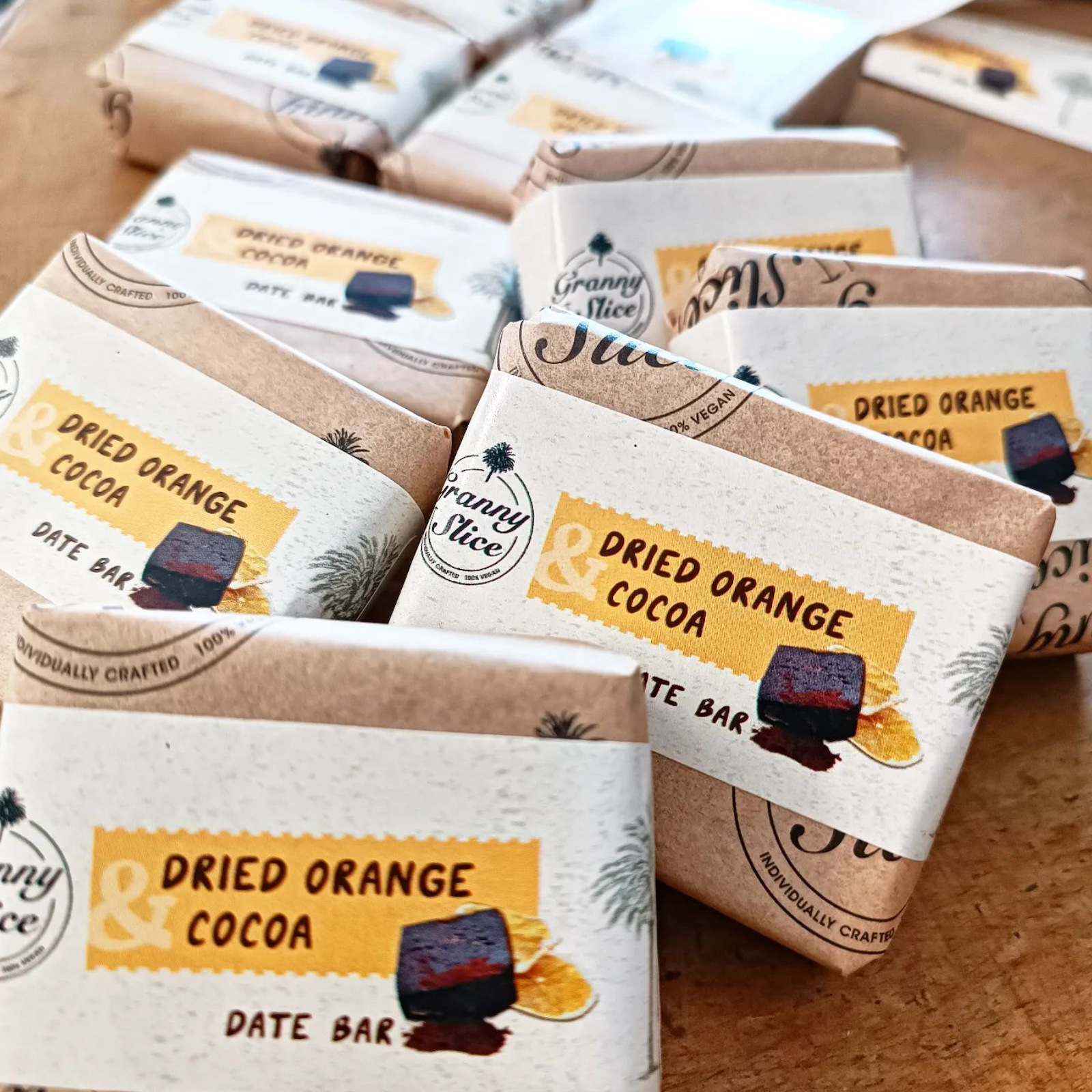
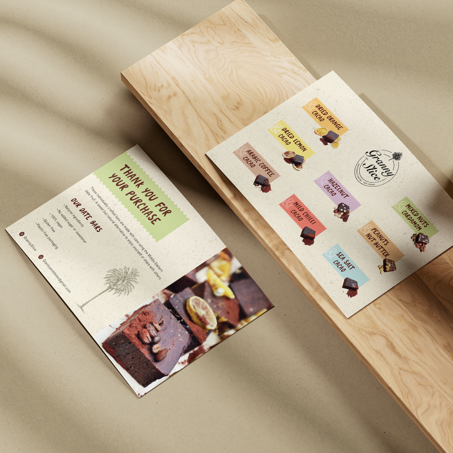
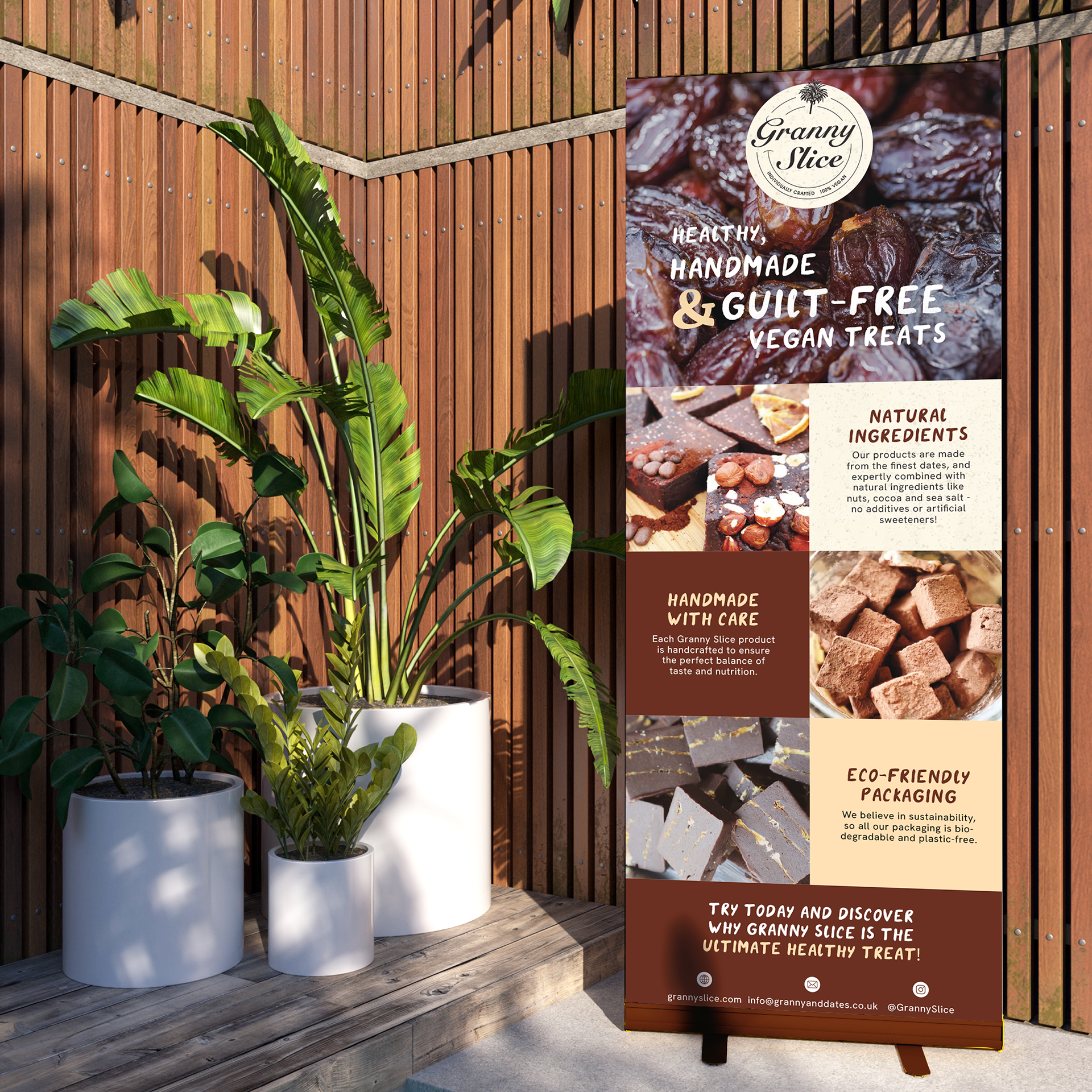
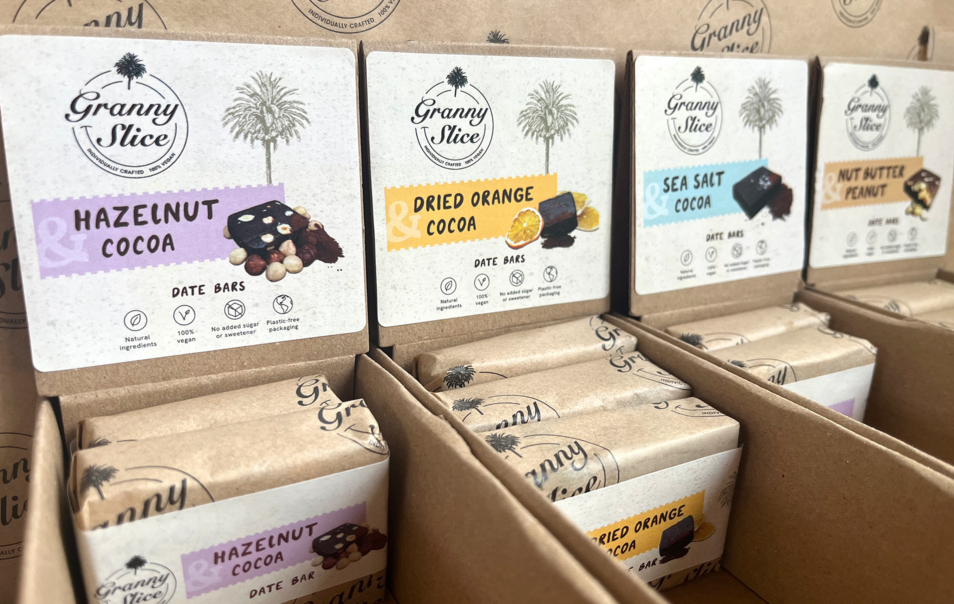
Granny Slice (previously Granny & Dates) aimed to reposition in the fruit and nut bar market with a more distinctive identity that boosted recall and highlighted its natural ingredients, requiring a new logo and packaging labels.
Challenges
The previous branding felt busy and lacked impact; the task was to create a clear, recognisable identity that reflected its Middle Eastern roots while keeping the product's natural ingredients front and centre.
Solution
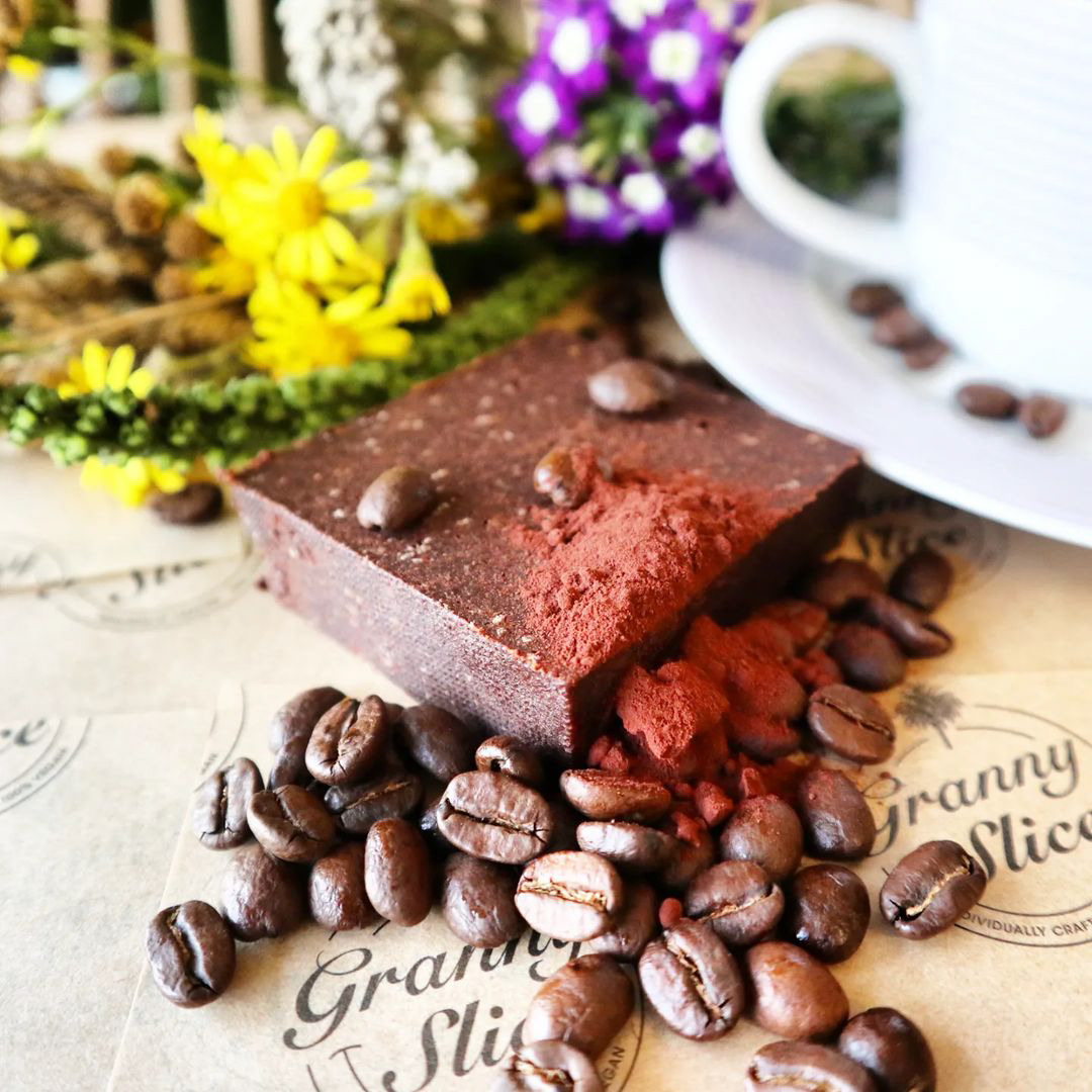
The new mid-market identity embraced Middle Eastern heritage through a custom typeface and date palm motif, paired with a market-stall-inspired backdrop and bold ampersand to unify the range.

Logo Before
Logo After